Performance Marketing
Art Direction
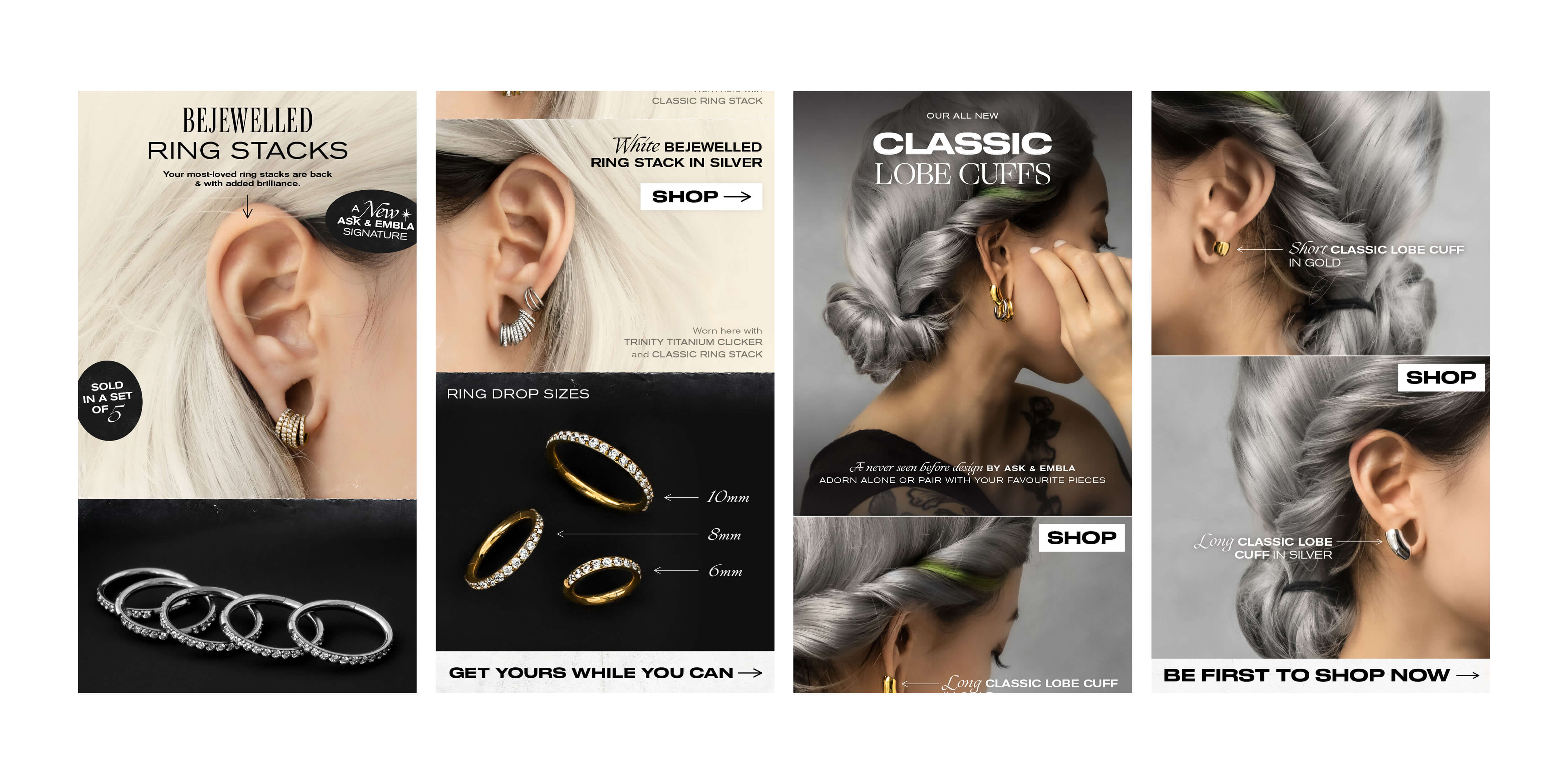
Optimising Brand without Compromise: Ask & Embla
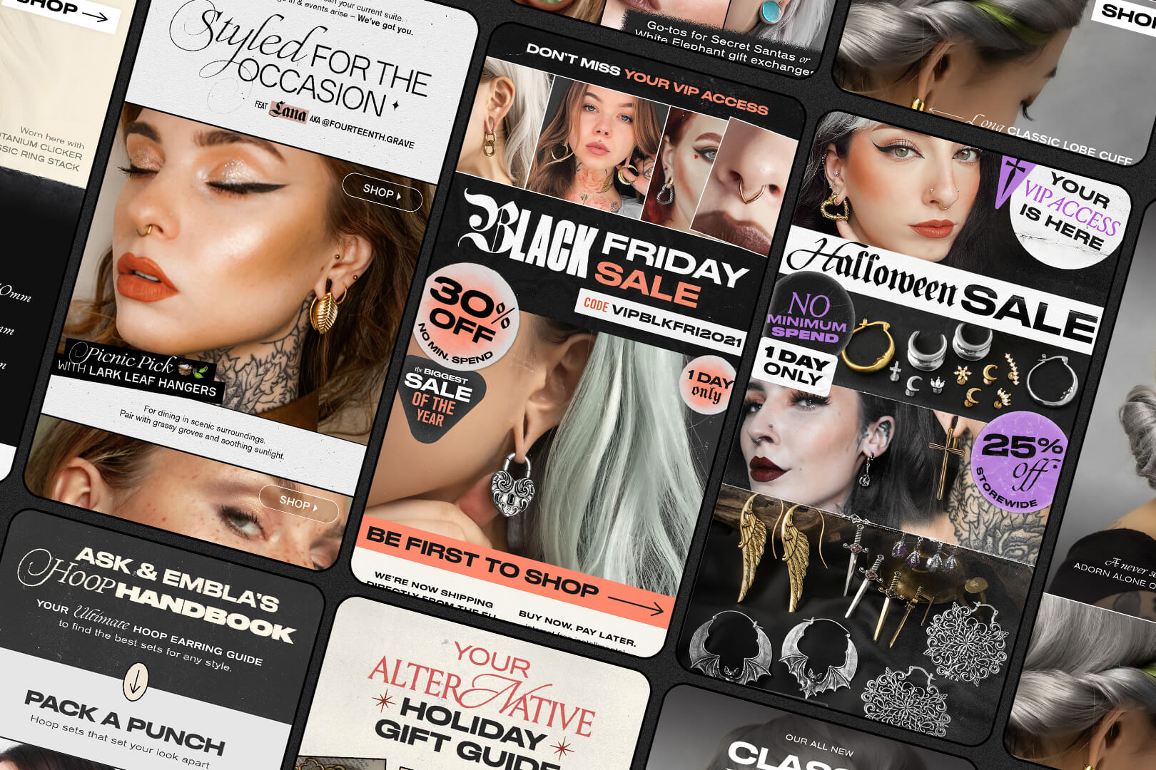
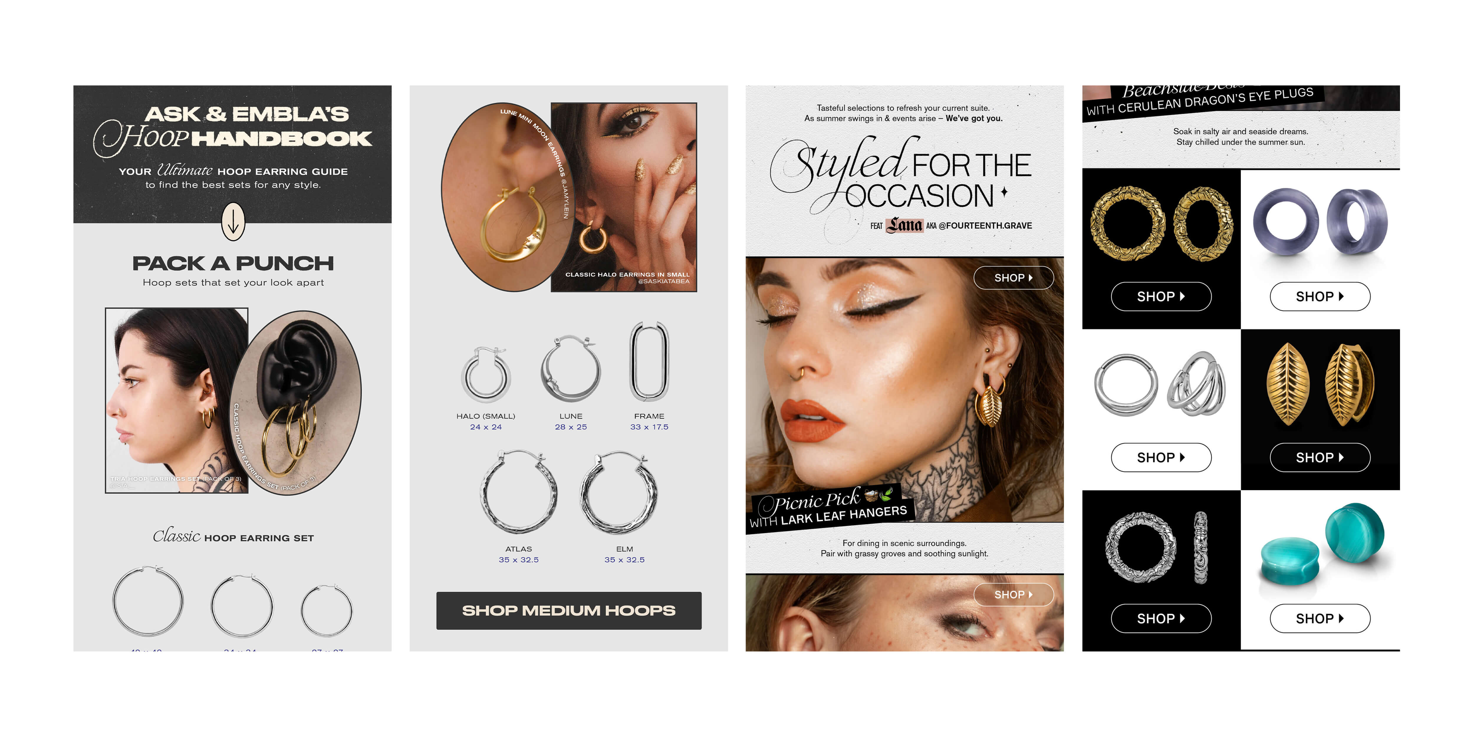
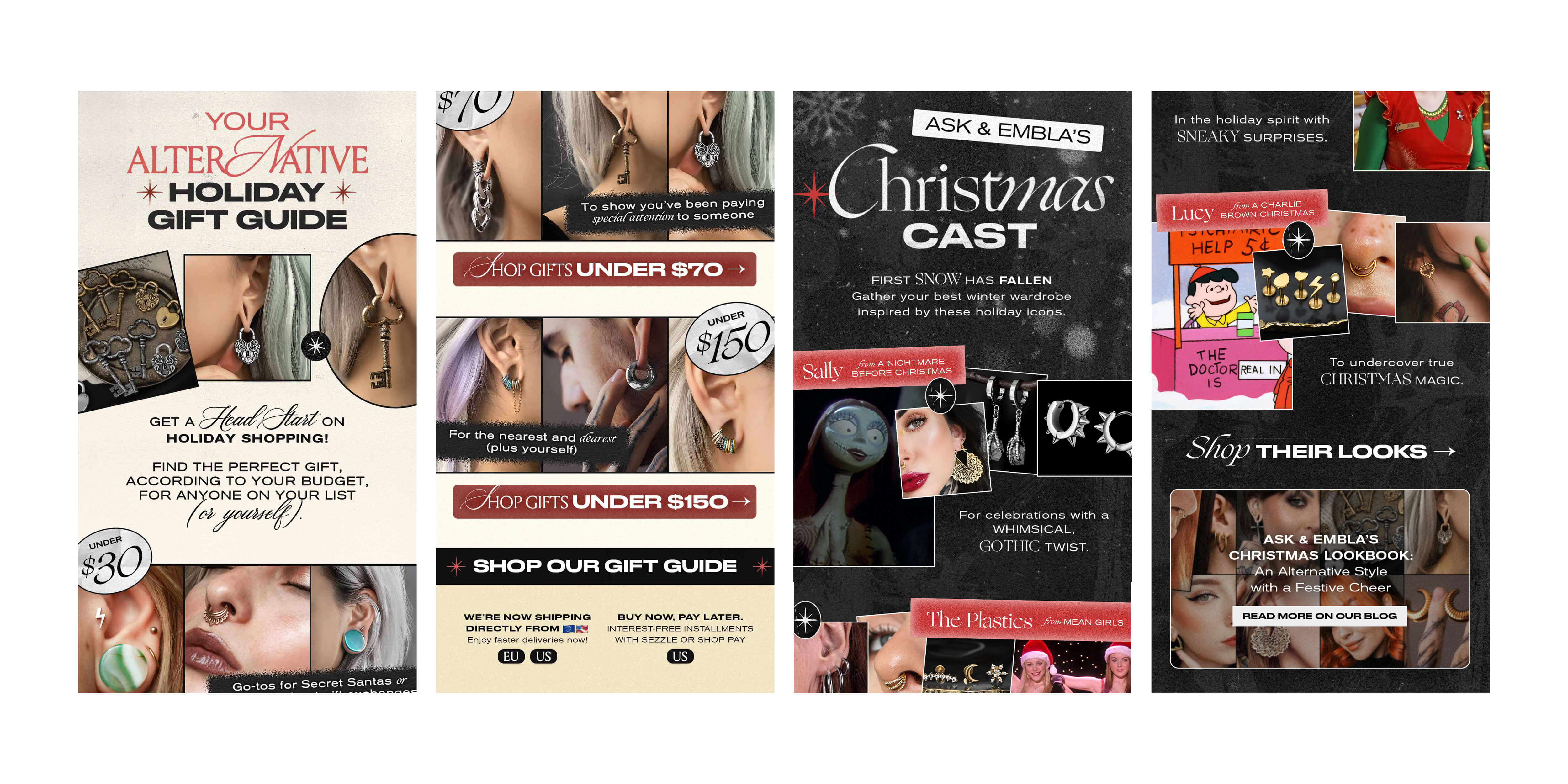
Ask & Embla is a Singaporean-grown jeweller with an international audience. My role as a Art Director was to mesh beauty and impact. It was one of my favourite things about working there - we were obsessed with crafting a brand that was visually authentic while simultaneously driving real business results.
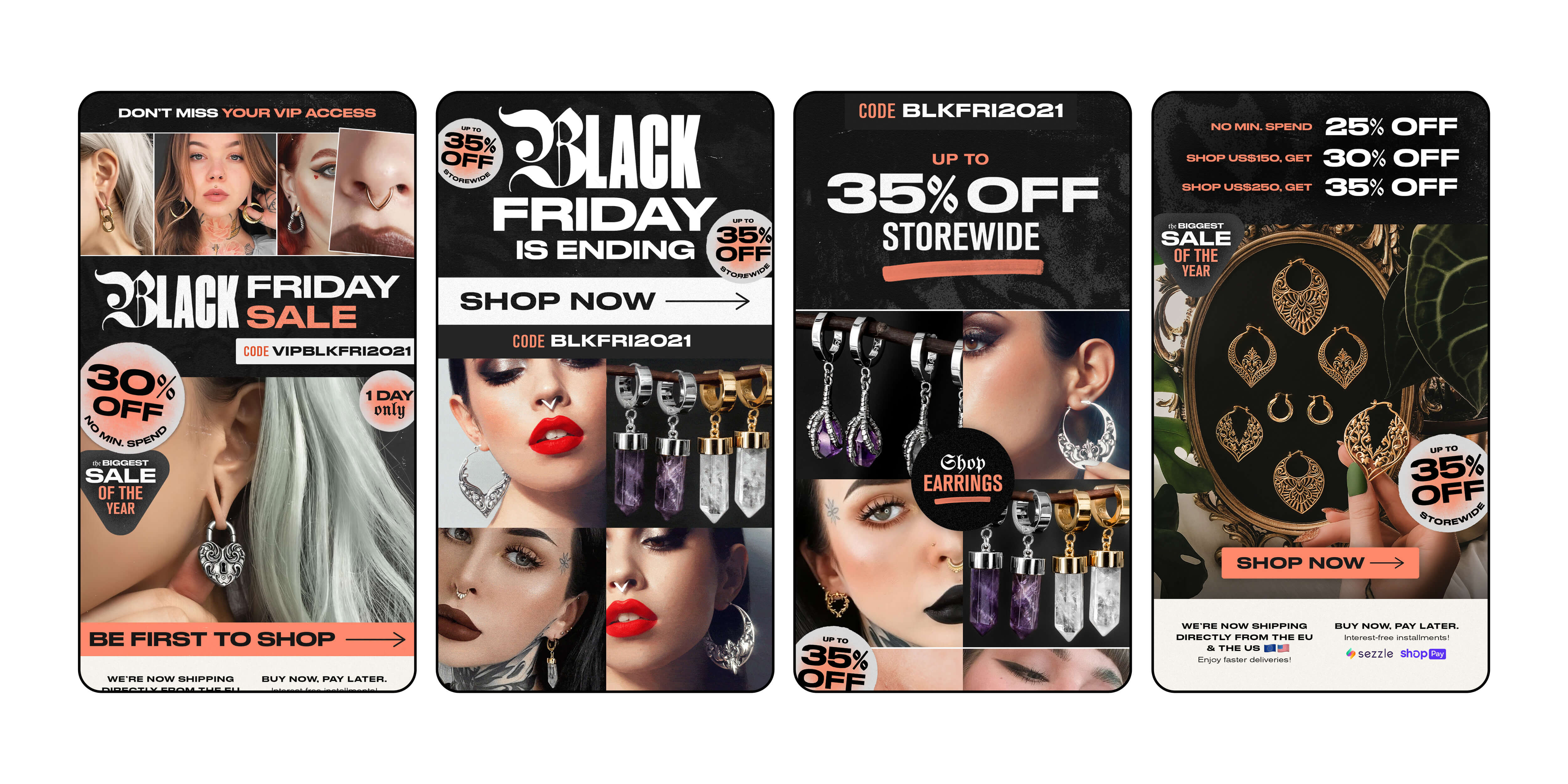
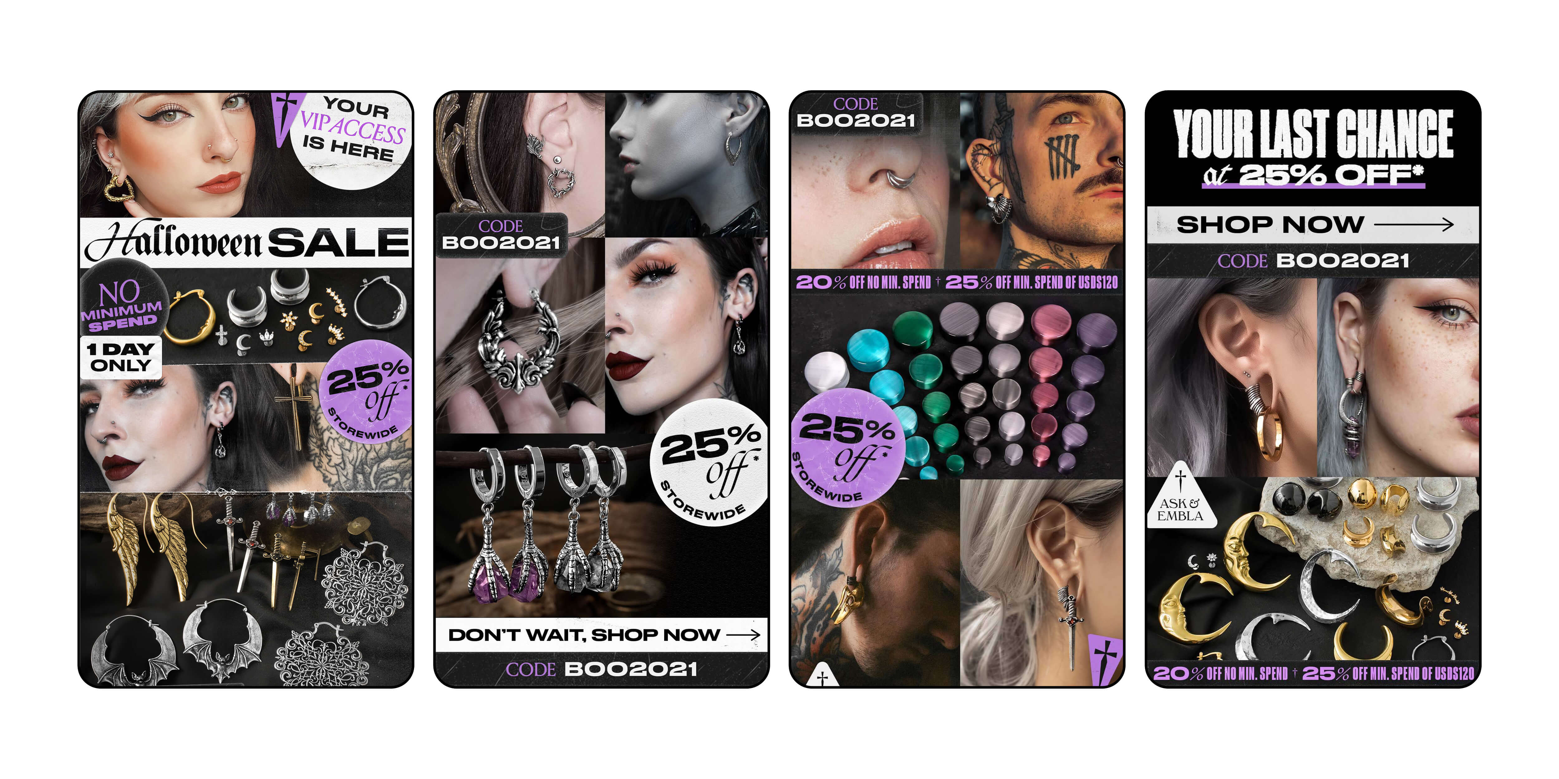
As I grew into my role as Art Director, I made a deliberate move towards performance marketing because I wanted to bridge aesthetic decisions with business outcomes. I partnered with the Digital Marketing team and on a bi-weekly basis, we gathered to analyse performance data and made hypotheses on what was resonating with the audience and what was not. Ultimately, this informed our data-led design iteration as we conducted our A/B variant testing on copywriting, layout design, image choice and so on. As time went by, our ability to read the data became sharper and our understanding of our audience deepened.
At the same time, we optimised without compromising or diluting the brand story. We kept performance-led sensibilities, but the visual identity was still alternative, edgy and rebellious. The balance of legible sans-serif typeface with gothic, or grunge and grain texture contrast with clear messaging. This was an important balance to strike.
Impact
Along with the digital marketing team, our efforts towards newsletter campaigns in 2021 led us to EDM revenue growth of 23%. I also led monthly design reviews to refine brand identity, share feedback, and maintain differentiation in a competitive jewellery market.